
We've seen plenty of examples of how Google spreadsheets are published on other sites - either with simple links or with embedded sheets and charts. In fact, I even created another blog just to keep a list of some interesting ones, since people are always pinging me to either say "Hey JR, give me some examples of how people are using spreadsheets to share information", or, "Hey JR, check this one out!".
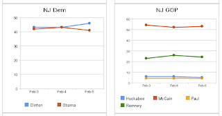
Well, today we saw another example worth blogging about. It's topical, it's professional, it's useful, it's fast - it's political... In covering Super Tuesday Poll results, Reuters used Google spreadsheets to generate and publish result charts for their web site. The image included here is a screen shot from their main 2008 Elections Page, which actually had 8 embedded charts last time I looked. We didn't do anything special to help Reuters do this, in fact, we came across this by chance just watching the results on their site.
If you've got interesting data you want to share, check out the publishing options in Google Docs, and even learn how to publish charts.
[update 6 Feb 2008 - Now that the voting is over, the charts as originally published have been swapped out of Reuter's Politics pages for more relevant, timely stories...sorry if you missed it.]


0 comments:
Post a Comment