Gmail’s new look

Back in July we showed you a preview of Gmail's new look, and we’ve been working this summer to make even more updates and improvements. Today, we’re giving you an in-depth look at the new design. If you like what you see, over the next few days you’ll be able to switch to the new look by clicking on Switch to the new look in the bottom-right of Gmail.


Streamlined conversations
Conversation view has been completely redesigned to help you read through your email threads. You’ll now see profiles pictures for your contacts, so it’s easier to keep track of who said what. We also stripped out as much as possible so you can focus on communicating with your friends and colleagues.


Elastic density
We know that you use Gmail from a variety of screen sizes and devices, so now the spacing between elements on the screen will automatically change based on the kind of display you’re using. If you prefer a denser view all the time, you can change your density manually in the Settings menu.


New HD themes
Themes have been completely rebuilt to enable us to bring you a new set of beautiful high resolution themes with imagery provided by iStockphoto. We've updated most of the old favorites as well and your theme will be automatically carried over to the new look. Go to the Settings menu to take another look at themes and choose the one that fits you best.


Smarter navigation
The navigation panel on the left keeps your labels and chat contacts in view at all times. It's also more customizable: you can resize the labels and chat areas if you want to see more, or hide the chat area entirely via the chat icon in the lower left. You can also use the arrow keys to navigate around the interface.


Better search
Click the dropdown in the search box to see a new advanced search panel, which makes it easier and faster to find exactly what you're looking for. You can use the same panel to create a filter from any search in just a few clicks.


We’re excited to finally share Gmail’s new look with you. We’ll be bringing these changes to everyone soon, but if you’d like to make the switch right away, we’re rolling out a Switch to the new look link in the bottom-right of Gmail over the next few days.


(Cross-posted from the Gmail Blog)

Google News highlights unique content with Editors’ Picks

(Cross-posted on the Google News Blog)

News organizations tell stories online in ways that bring together the best of traditional and digital journalism, whether that involves long-form investigative features, compelling photo slideshows or interactive maps and charts that add new levels of engagement to the day's news. To help connect you to the best works of news publishers, Google News is introducing a new section in the right-hand column of the U.S. edition. The section is called "Editors' Picks,” and it displays original content that publishers have selected as highlights from their publications. This is the latest addition to recent improvements we’ve made to the variety and presence of stories and multimedia on Google News.

An array of news organizations, including local, national and niche publishers, are now using Editors’ Picks to display their best, most engaging content. Because Google News relies on algorithms, Editors' Picks will always be just that—picks provided by publishers themselves, and not by Google. You can browse a set of publisher feeds that span national, specific and local interests—like The Atlantic, The Wall Street Journal, ProPublica, the Guardian and The Root, among many others—via the side-to-side arrows next to each publisher's logo. The feeds you see are chosen based on a variety of factors, including your news preferences. If you’re interested in using source preferences on Google News, Editors' Picks helps you do that with the slider that appears just below the articles.


You may have first noticed Editors’ Picks as an experiment last year. Based on the data from that experiment, we have been working with nearly two dozen publishers in recent months and have seen a positive response from readers and publishers alike: readers get the news they're interested in from the sources they trust, and publishers receive higher traffic to their websites. We encourage any news organizations that are interested to visit our Help Center to get started.

Calling from Gmail now in 38 languages, with lower rates to over 150 destinations

We’re always trying to make it easier for people to connect—whether that means sending an email, chatting or video chatting, you can reach the people you care about from right inside Gmail. Last year, we made it possible for those of you in the U.S. to call any mobile phone or landline directly from Gmail and starting today, we are making this available to many more of you who use Gmail outside the U.S. by offering calling in 38 new languages.


You can now buy calling credit in your choice of four currencies (Euros, British pounds, Canadian dollars or U.S. dollars) and there are no connection fees, so you only pay for the time you talk.

To help reduce the cost of staying connected, we’re also lowering our calling rates to over 150 destinations around the world. For example, it’s now only $0.10 (or €0.08) per minute to call mobile phones in the U.K., France or Germany (landlines are $0.02/min), $0.15/minute to call mobile phones in Mexico and $0.02/min to call any phone number in China and India. The complete list is available on our rates page.

We’re rolling out this feature over the next few days, so if it’s available in your country you’ll see a little green phone icon show up at the top of your chat list and you’ll be ready to make calls (you’ll need to install the voice and video plug-in if you haven’t already). If you're a Google Apps user, your domain administrator must have Google Voice and Google Checkout enabled in the administrator control panel in order to be able to use this feature.


Calls to the U.S. or Canada placed within those countries will continue to be free at least for the rest of 2011. Calls to the U.S. or Canada placed from outside these countries will be charged $0.01 per minute (or €0.01, £0.01, C$0.01 per minute).

Evolving the Google design and experience

Starting today, you might begin noticing that things look a little different across Google products. We’re working on a project to bring you a new and improved Google experience, and over the next few months, you’ll continue to see more updates to our look and feel. Even our classic homepage is getting a bit of a makeover:

New Google homepage with a smaller logo and links moved to the top and bottom edges of the browser for a cleaner look

The way people use and experience the web is evolving, and our goal is to give you a more seamless and consistent online experience—one that works no matter which Google product you’re using or what device you’re using it on. The new Google experience that we’ve begun working toward is founded on three key design principles: focus, elasticity and effortlessness.
  • Focus: Whether you’re searching, emailing or looking for a map, the only thing you should be concerned about is getting what you want. Our job is to provide the tools and features that will get you there quickly and easily. With the design changes in the coming weeks and months, we’re bringing forward the stuff that matters to you and getting all the other clutter out of your way. Even simple changes, like using bolder colors for actionable buttons or hiding navigation buttons until they’re actually needed, can help you better focus on only what you need at the moment.
  • Elasticity: In the early days, there was pretty much just one way to use Google: on a desktop computer with an average-sized monitor. Over a decade later, all it takes is a look around one’s home or office at the various mobile devices, tablets, high-resolution monitors and TVs to see a plethora of ways to access the web. The new design will soon allow you to seamlessly transition from one device to another and have a consistent visual experience. We aim to bring you this flexibility without sacrificing style or usefulness.
  • Effortlessness: Our design philosophy is to combine power with simplicity. We want to keep our look simple and clean, but behind the seemingly simple design, use new technologies like HTML5, WebGL and the latest, fastest browsers to make sure you have all the power of the web behind you.
Constant revision and improvement is part of our overarching philosophy. For example, last year we introduced an updated look and feel to our search results, and if you compare the original Google homepage to today’s version, you’ll see that a makeover every so often can certainly be refreshing:

Original Google homepage in 1997

Starting today and over the course of the next few months, look for a series of design improvements across all our products, including Google Search, Google Maps and Gmail.

Beefing up goo.gl with new features

(Cross-posted on the Social Web Blog)

Since we launched our URL shortener goo.gl last September, we’ve been lucky enough to build a thriving and growing community of passionate users who aren’t shy about letting us know when something could be better. We appreciate the feedback, and today we’ve completed a series of feature rollouts aimed at addressing your most common requests.

Copy to clipboard

Now you can easily copy new short URLs to your clipboard, a frequently requested feature on our forums. When a new short URL is created, the text on the page will automatically be highlighted, and you can simply press Control+C (or Command+C on a Mac) to copy it.


Remove from dashboard

You can also now remove items from your dashboard, so that you can see a quick summary of only your most important links and hide the ones you no longer need. Please note that when you hide a short URL, you’re only removing it from your own dashboard. The URL will still exist and work. You can’t add short URLs back into your dashboard once you’ve hidden them, so be sure you won’t need to find that short URL from your dashboard later. Remember that you can always view analytics for any of your short URLs by appending a “+” to the end of them (e.g., http://goo.gl/rQ6HT+). This feature will be rolling out over the next several days, and may not work immediately on mobile devices.


Spam reporting

Many of you told us that you’d like a way to tell us about goo.gl URLs that lead to spam sites. We recently set up goo.gl/spam-report for just that purpose. So far it’s helped us a lot in identifying and blocking short URLs that lead to spam, so keep those reports coming.

Ongoing speed and stability improvements

Even as we add features, we continue to focus on making goo.gl one of the fastest and most reliable URL shorteners on the web. We’ll continue working hard to ensure that we add minimal latency to the user experience and extend our track record of rock-solid reliability—we’ve had no service outages since we launched last September.

We hope you find these new features useful, and we look forward to your continued feedback.

Fresh new perspectives for your blog

(Cross-posted from Blogger Buzz)

Today we’re previewing five new dynamic templates in Blogger that you’ll soon be able to customize and use for your blog. These new views use the latest in web technology, including AJAX, HTML5 and CSS3, to deliver a host of benefits to you and your readers:
  • Infinite scrolling: read more posts without having to reload or click to a second page
  • New layouts: different views suited to different types of blogs
  • Speed: download images as you view them, not all at once in advance
  • Interactivity: there are now more ways to experience and engage with blog content


Click on any of these links to take the new dynamic views for a spin on a few of our favorite blogs: Flipcard, Mosaic, Sidebar, Snapshot and Timeslide.

Flipcard

Snapshot

Mosaic

To try these views on your own blog, simply add “/view” to the end of the blog URL—for example, http://buzz.blogspot.com/view. These new views are available on all public Blogger blogs with feeds fully enabled—to learn more, including how to disable these views for your blog if you wish, please see our help center article.

We’re previewing these templates early on so we can incorporate your feedback for a wider launch soon. At that time you’ll be able to customize these templates and select one for your blog. Please let us know what you think!

The Google design, turned up a notch

This week we introduced our latest update to search, and I wanted to share a bit of our thinking on the design team. In short, we tried to take all the things we strive for at Google and make them better: powerful technology, snappy results, simplicity and a fun and quirky personality. Our goal was to take a design known by millions of people and make it better. As a designer, it’s hard to think of a more exciting challenge.

During our process we focused on people’s rising expectations for search. As the web has evolved over the past decade, people have been typing more sophisticated searches and seeking out specialized search tools to match. To keep pace with rapid change online, we have teams of engineers working across Google to develop new ways to present and refine search results. Our central challenge with our latest redesign was to figure out how to squeeze all these tools and technologies into a single page.

A common way to expand the flexibility of a website has been to add a left-hand panel of links, often referred to by designers as a “left-hand nav.” We’ve been creating mocks of left-hand panels since the earliest days of Google and have tested these designs with users as far back as 2006. Overall, we’ve found they can provide a great way to navigate without getting in the way of the main content, but they can also be distracting. Our users want more powerful tools, but they also want the simplicity they’ve come to expect from Google.

As a first step towards finding that balance, we introduced the Search Options panel last May, including a toggle to open and close. This way we could quickly try out new search tools, such as refinements by time and content types. Using the lessons from Search Options, designers, researchers and engineers worked side-by-side to explore a vast array of possibilities for a permanently open panel of search tools. We made hundreds of prototypes and gathered feedback from user studies, Googlers and through experiments — including one of our largest visible experiments ever. In the end, we came up with a design that provides dynamic, relevant search tools on the left, while lightening and updating the aesthetics all around. Here’s a picture of the Search Options panel (left) and our new results page (right):


We knew that adding a left-hand panel would inevitably add some weight to the results page, so we took a number of steps to lighten other aspects of the design. The overall visual redesign started with the Google logo. Here’s an image comparing the old logo (top) and the new logo (bottom):
The new logo is lighter, brighter and simpler. We took the very best qualities of our design — personality and playfulness — and distilled them. The logo was the foundation for new icons and hundreds of tiny alterations designed to accommodate and seamlessly integrate the expanded functionality of the left-hand panel. For example, we lightened up the footer at the bottom of the page by removing the blue shading and the underlines on the links, lightening the color and expanding the search box. Here’s a picture of the old footer (top) compared with the new (bottom):

While I’m very happy about our latest improvements, a designer's work is never done. We’re already testing additional refinements and we'll continue to listen to all of you as we work to continue making search better.

If you’re curious, here are some of the other design prototypes we tried (you might have to click to magnify some of these images):
  1. Blue homepage: We’ve always had a strong affinity for blue — after all, blue is usually the color of web links, so it binds the web together. It became the basis for many designs.
  2. Blue button: The big blue button made it all the way to our first external experiment, where it was promptly rejected by users. We heard you loud and clear and changed the button in the next round.
  3. Universal bars: This design emphasizes different types of results with labeled blocks in the main results pane, such as books, news and shopping.
  4. Blue results: This is one of the final blue designs we created and marks the point when we renamed the "Web" link to "Everything" — a label that gets closer to the intent of our mission to organize all the world’s information.

Google’s coming to Austin for SXSW

Like many of you out there, we’re gearing up for the SXSW Interactive Festival, which starts tomorrow, March 12 in Austin, TX. In just a few short hours, dozens of Googlers and YouTubers will be descending on Austin for a packed weekend of panels, demos and parties. Of course, we’ve also got a few fun things up our sleeve:
  • Representatives from Google and YouTube will be speaking on more than 20 panels on a variety of subjects, including open source, mobile, real-time communication and user experience design.
  • At the Google booth, we’ll be doing demos on a wide range of products, including Google Maps, Blogger, Wave, Reader and YouTube, and sessions on building apps for App Engine, extensions on Chrome and accessibility APIs and hacks for Android.
  • On Sunday, our all-day Hackathon will give you the chance to get your hands dirty and build applications using a variety of Google technologies. At the end of the day, we’ll award prizes, including Android phones, for the best apps.
  • We’re sponsoring the festival’s first Mothers’ Room, where nursing moms can go for comfort and privacy.
Finally, we’ll be seeing you at as many parties as we can go to at one time, including Bikehugger’s Mobile Social, where representatives from the Google Maps team will be handing out schwag and dishing dirt on how they built bike directions, the Blogger/Reader party, where you’ll have a chance to chat with members of those teams about new features, and (last but not least) the SXSW Film Closing/Music Opening, co-sponsored by YouTube and VH1.

You can read more about all of the Google happenings on our SXSW website, and follow @googlesxsw on Twitter for last-minute updates and news from Austin. We can’t wait to hit the ground running (or biking), and we look forward to seeing you there!

Understanding the web to make search more relevant

Last year at our second Searchology event, we announced Google Squared and Rich Snippets, two approaches to improve search by better understanding the web. Today, we're kicking off the new year with two improvements based on those technologies. First, we're applying the research behind Google Squared to add a new "answer-highlighting" feature to search, and second we're expanding Rich Snippets to include events.

Answer highlighting in search results

Most information on the web is unstructured. For example, blogs integrate paragraphs of text, videos and images in ways that don't follow simple rules. Product review sites each have their own formats, rating scales and categories. Unstructured data is difficult for a computer to interpret, which means that we humans still have to do a fair amount of work to synthesize and understand information on the web.

Google Squared is one of our early efforts to automatically identify and extract structured data from across the Internet. We've been making progress, and today the research behind Google Squared is, for the first time, making search better for everyone with a new feature called "answer highlighting."

Answer highlighting helps you get to information more quickly by seeking out and bolding the likely answer to your question right in search results. The feature is meant for searches with factual answers, such as [meet john doe director], [john lennon died], or [what was the political party of president ford]. If the pages returned for these queries contain a simple answer, the search snippet will more often include the relevant text and bold it for easy reference.

Consider the example, [empire state height]. The first search result used to look like this:

With today's improvements, the answer —1250 ft, or 381 m — is highlighted right in the search result:

This kind of quick answer only makes sense for certain kinds of searches. For example, the answer to [history of france] can't readily fit in a search snippet. However, for the kinds of information you can easily put in a table, we've been able to take what we've learned from Google Squared to make search better for a wide range of queries. Answer highlighting is rolling out during the next couple days on google.com in English.

Rich Snippets for events

Sometimes the easiest way to understand somebody is by having a conversation. The web is similar. As much as we're happy with the progress we're making with Google Squared, we also appreciate that a great way to understand web pages is to simply ask webmasters to teach us (and other search engines) about their content. To that end, we continue to make improvements to our search results with Rich Snippets, enabling webmasters to annotate pages with structured data in a standard format.

So far we've launched improved search result snippets for reviews and people. When your search results contain web pages with review information, you might see the number of user reviews on the page and the average rating in the search result. When your search contains a public profile page about a person from a social networking site, you may see the person's location and occupation, or a list of her friends.

Today, we're announcing support for a new Rich Snippets format for events. The new format improves search results by including links to specific event names, dates and locations. Here's an example of a new event result from livenation.com if you search for [irving plaza]:


The new result format provides a fast and convenient way to identify pages with events and click directly to the ones you find interesting. If you're into Hip Hop Karaoke, you can quickly find out when and where the next show is in Irving Plaza, and click for more info. We've been working with a few sites to ramp them up for our initial launch, but it will take time for other webmasters to start implementing the new markup. Check out our blog post on Webmaster Central for more details.

Go thataway: Google Maps India learns to navigate like a local

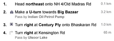
Have you ever been lost? Perhaps you missed a turn because a street sign was poorly labeled, hard to see in the dark, or just not where it should have been? These are problems we've all faced, but they're especially complicated in India, where street names are not commonly known and the typical wayfinding strategy is to ask someone on the street. Without road names, it's difficult to produce a set of directions that makes sense. Just take a look at this screenshot of Google Maps directions in India in 2008 and you'll get the picture:


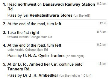
To solve this problem, this week we launched an improvement to Google Maps India that describes routes in terms of easy-to-follow landmarks and businesses that are visible along the way. We gathered feedback from users around the world to spark this improvement to our technology, and we thought we'd give you a glimpse at our thinking behind this launch.

We knew from previous studies in several countries that most people rely on landmarks — visual cues along the way — for successful navigation. But we needed to understand how people use those visual cues, and what makes a good landmark, in order to make our instructions more human and improve route descriptions. To get answers to these questions, we ran a user research study that focused specifically on how people give and get directions. We called businesses and asked how to get to their store; we recruited people to keep track of directions they gave or received and later interviewed them about their experiences; we asked people to draw us diagrams of routes to places unfamiliar to us; we even followed people around as they tried to find their way.

We found that using landmarks in directions helps for two simple reasons: they are easier to see than street signs and they are easier to remember than street names. Spotting a pink building on a corner or remembering to turn after a gas station is much easier than trying to recall an unfamiliar street name. Sometimes there are simply too many signs to look at, and the street sign drowns in the visual noise. A good landmark always stands out.

We also discovered that there are three situations in which people resort to landmarks.

The first is when people need to orient themselves — for instance, they just exited a subway station and are not sure which way to go. Google Maps would say: "Head southeast for 0.2 miles." A person would say: "Start walking away from the McDonald's."

The second situation is when people use a landmark to describe a turn: "Turn right after the Starbucks."

The third use, however, is the most interesting. We discovered that often people simply want to confirm that they are still on the right track and haven't missed their turn.

Giving people this sense of confidence while they explore an unfamiliar territory became one of the goals of our redesign. Over the course of several months, the team brainstormed various ways of presenting the information contained in Google Maps in a way that would be useful for people. We then settled on a design that added some landmarks to describe the turns and confirm the route.


The next step was to put this design to a test with drivers in Bangalore, India. The results were eye-opening. While we were on the right track with introducing landmarks, we still relied on street names too heavily. Drivers wanted more confirmation. They wanted to compare what they saw on Google Maps with what they saw from the driver's seat, every step of the way.

We added more landmarks along routes and reduced the visual prominence of street names, and the result was our final design:


Now Google Maps India gives you directions like a local would. Happy wayfinding!